Go into any bookshop and you’ll see a smorgasbord of design styles.
There will be the big, bold, blocky text covers; the abstract image covers; the hand-drawn lettering in twee frame covers; the photograph covers.
All of these are trying to communicate something to you. It’s the publishers' first opportunity to impress upon readers information about genre, themes, similar books, and even the reader’s own age and gender.
A good cover can help a book reach its intended audience, while a bad cover might be the reason a new author never gets the opportunity to publish a follow-up.
It wasn’t always like this, though. Up until the 19th century, book covers were merely an extra piece of paper intended to protect the book from damage and dust before purchase.
“It is where we get the term ‘dust jacket’ from to describe the detachable covers that feature on hardback books today,” explains Dr Michael John Goodman, designer and expert in print culture.
“These books were wrapped up in plain paper, and when a reader got them home they would rip this dust jacket off like the gift paper on a birthday present,” he says, remarking that an unfortunate side effect of this practice is few remain today for historians to study.
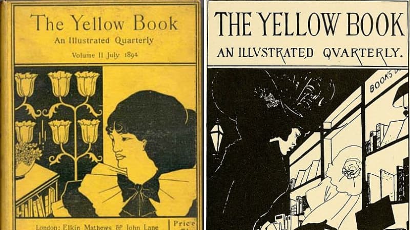
Everything changed when British literary periodical ‘The Yellow Book’ started publishing dust jackets with images on them, designed by Aubrey Beardsley, in 1894.
At first controversial, ‘The Yellow Book’ method caught on, and by the early 20th century book cover design was an established art form.
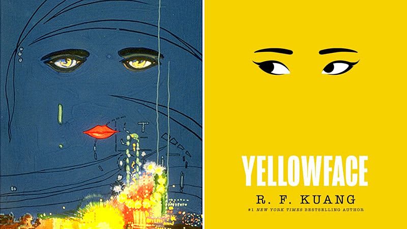
130 years after ‘The Yellow Book’ changed book cover design, one of the most notable book covers to grab the attention of readers was for Rebecca F. Kuang’s bestseller, ‘Yellowface’.
Kuang’s satire of racial diversity in the publishing industry won plaudits for its incisive writing, but its success was no doubt also influenced by its visually affecting cover: two eyes staring out from a bold yellow background.
It’s simple but ingenious. The cover was one of around 75 designs a team of four created, says Ellie Game, deputy art director at HarperCollins Publishers.
Given the brief a year before publication, Game and the three other designers knew expectations were high for ‘Yellowface’. The publisher was excited, but “that usually means that they get very nervous about the cover,” she says. In the brief, they were told it needed to look like a “big book”.
“That's a classic phrase, which basically means, ‘can it look like nothing else, but also, everything else?’” Game explains.
Briefs like this are typical of the tightrope all book designers walk between artistic expression and risk averse commerciality.
“Book covers and design exist at a fascinating intersection between art and commerce,” says Goodman.
As one of publishers' primary forms of advertising, decisions over a book's look must take into account more than just the author and designers' personal preferences.
Game agrees that “designers always want to do something that's slightly different and moves things on,” while retailers are often more interested in the familiar styles that clue consumers into what they’re buying.
“It can sometimes be tricky to do anything that looks wildly different, because then you run the risk that people don't know what it is. And it's unfamiliar. So they don't buy it,” she says.
It’s why there are a handful of standard template ideas that every designer can list as the go-to for certain genres. Top of the list is the “woman walking away” trope, used for almost every historical romance book aimed at female audiences.
Other genres are guilty of similar stereotyping. Since the success of Richard Osman’s ‘Thursday Murder Club’ series, so-called “cosy crime” has exploded, all copying a combination of scrawled handwriting and small visual elements for their covers, notes Goodman.
Then there are the thrillers that typically go for the author’s name in huge typography on top of a bland image, or the intellectual nonfiction works, like ‘Atomic Habits’ and ‘Sapiens’, which all feature cream backgrounds and sparse imagery of something vaguely academic.
More often than not, publishers just want to prioritise the text being as big as possible to sell the title and the author, slapping it on top of a generic image. Yet even when designers try something different that works, publishers can still be antsy about risk.
Elisha Zepeda is a freelance book designer. The agency he works with was told by a publisher that their best-selling title featured an intricate design with pictures weaving through text. “But since we got that approved, they haven't approved anything else like that,” he says.
He also regularly loses fights against the “woman walking away” trope, noting that non-White people are underrepresented on these covers. “Everything ends up looking like the same thing. I feel like best sellers become best sellers because they're different. Not because they look like the previous book that you're trying to market to,” he says, frustrated.
In recent months, Zepeda has gone viral for his TikTok channel that illuminates the process of book cover design. To over 300,000 followers, he creates different options for briefs before presenting the one publishers officially choose. It’s one of the most satisfying watches on the platform and fits neatly into the popular #BookTok trend.
Readers increasingly engage with literature through social media, which has had an impact on the way designers approach their briefs. As people compare their books on TikTok or Instagram, publishers have taken note that a bold, evocative cover will sell their books better through those sites.
“I think the book continues to become like a covetable object,” Game says. “People want things that feel nice and are worth spending their money on. They want something that is going to sit on their shelf and be a really nice object beyond just being a good book.”
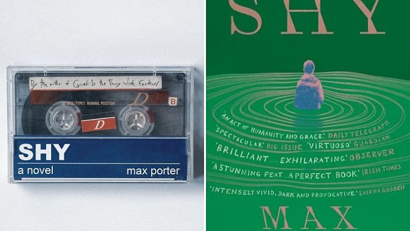
One of the results of social media growing as an advertising tool for publishers is that many no longer release different covers in different territories. A point of pride for Game is that her cover for ‘Yellowface’ is the one used in every region the book is printed. Although this is a growing practice, with Goodman noting his preference for the US version of Max Porter’s latest book ‘Shy’.
Goodman points to the success of e-readers like Kindle as another factor that has made publishers place “greater emphasis on book design so that the physical book becomes a desirable material object, distinct from its digital counterpart.”
While publishers and retailers will always have the market on their minds – sometimes covers are even dictated by the kinds of stores the books will be sold in – for designers, artistic expression is at the heart of what they do.
“I don't think people are going into a book store scanning titles, necessarily. If something's going to make you pick up the book, it's going to be the artwork. So why are we not focusing on artwork?,” Zepeda says.
Conscious that publishers need to ensure they attract their target market, he also wonders if that is sometimes limiting. “If you do something that is, I don't know, a lot more just generally beautiful, you're appealing to that same audience but you're also appealing to everyone else who just finds good design attractive.”
It’s a sentiment that Goodman shares, bemoaning the sameness of bestsellers. “Imitation, as they say, is the sincerest form of flattery, and in a hugely competitive market publishers are notoriously risk averse, especially if they have been successful in the past with a certain design.”
Still, it doesn’t deter him from his love of good book cover design: “I regularly treat trips to the book shop like I’m going to an art gallery – but the best way to experience novelty and some of the more experimental cover designs is to step away from the top ten.”