
There is a lot of data visualisation about COVID-19 which can be misleading. We identified five common mistakes in data visualisation and how one can spot them.
By Nabeela Khan
Visualising data is the most comprehensive approach to depict the scale of the problem. But with information overload, we all have come across hundreds of maps and infographics depicting the scale of the pandemic in the past 4 months. However, not all of them reflect the true picture or may have problems in scales which may end up showing a few countries always on top and eventually shaping a different perception of the crisis.
Another major issue is the fact that this pandemic is evolving, cases collected are being reported by different countries in different ways and it’s difficult to grapple with the complexity of this pandemic. So, let’s take a look at the factors which make visualisation confusing and may mislead people.
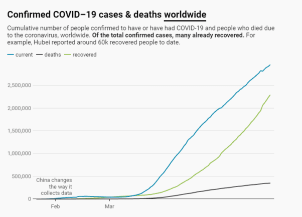
Variation in cases reported:
From January to date, we have seen significant variation in case of counts due to changes in methodology – what is being reported as a confirmed case. Case counting methodology contributes to the difference in numbers and a sudden spike. Earlier, only laboratory-confirmed cases of COVID-19 were reported by China to the WHO. This methodology was revised by adding clinically diagnosed cases and added to the confirmed cases. This addition saw a sharp spike in the number.
At the same time, other dashboards including the John Hopkins database include estimates of ‘presumptive positive cases’ which also represents the actual impact of the disease. Since counting methodology adds to the difference in numbers, earlier cases reported from China cannot be compared with other datasets. The chart can rightly be read if the classification of numbers used is consistent or consists of notes clearly highlighting changes in the data collection process.
Difference between case data and per million population
If one looks at the case count, countries hit hardest will always be on top but case counts don’t account for the population of a country because different demographic groups are impacted differently. So when we look at per million population and cases, the results paint a different picture altogether. India has close to 1.3 billion population and Germany has 83 million. Germany has slightly higher cases than India at the moment but there is a significant difference in the population impacted and per million people infected. At the time of writing this report, India reported only 110 total cases per million population whereas Germany reported 2,164 cases per million population. This puts the smaller in population size countries to appear always on top highlighting that more people are getting affected replacing countries harder hit than any other country which may have had more cases.

Testing rate is crucial
The above factor cannot be discussed in isolation and the testing rate remains the most important factor when we talk about cases, fatalities, and recoveries. Most countries are not testing a huge number of people right now suggesting that there might be a lot more cases than the current numbers. Therefore with a huge difference in testing numbers, it is not ideal to compare case counts between different countries. The countries with the highest infection rates also have high testing rates highlighting the correct extent of the problem. But testing capacity around the world cannot be the same, therefore infections are going undetected.
Using a logarithmic X-axis
A logarithmic scale or log scale displays data over a wide range of values in a compact way. The largest numbers in the data are hundreds or even thousands of times larger than the smallest numbers. Therefore, the highest numbers will get the most squished on a log scale. For example, if you put the number of deaths in the US and UK on a log scale, the difference between the two will look comparatively very small like here:
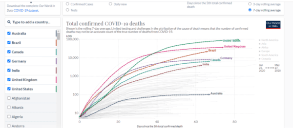
But this is not exactly true; the number of deaths in the US is more than double that of the UK. Similar is the case of comparison between the UK and Germany. Germany has close to 84,98 deaths but the log scale reflects a little difference between the UK and Germany. This is due to the fact that on a log scale the value is multiplied starting from 10 multiplied to make 100 further multiplied to reach 1000 and a 100,000 implying that there is no fixed amount of space on this chart for a certain number of cases. The first 10,000 will take maximum space on this chart whereas the next 10,000 deaths take very little space. Therefore, one must carefully read the numbers on such charts before making a derivation based on bars and lines.
The headline and design choices
In the entire coronavirus coverage, it is worth mentioning the number of recovered cases or fewer reported new infections in a day. The purpose of graphs is not to scale up the problem but to depict the real picture. Similarly, the choice of colour matters most, red colour generally invokes fear. Also, if you scale bubbles on a map to the number of COVID-19 cases, the bubbles for countries with the highest cases may envelop the entire map.
Furthermore, the choice of design hugely impacts information being disseminated and the smallest of mistakes may end up questioning the authenticity of the information.

As you can see in this pie chart, the percentages from each section add up to more than 100%.